


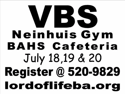
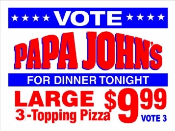
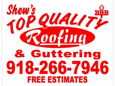
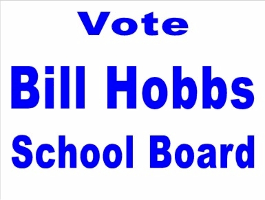


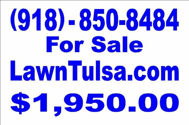
12 x 18 (small)
18 x 24 (large)

I'll give you a few
pointers.
Background Colors:
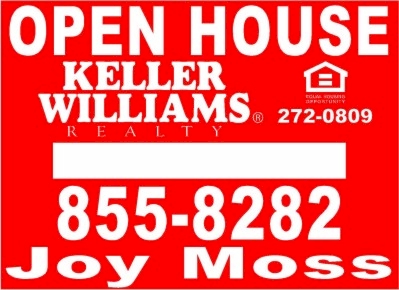
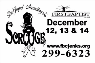
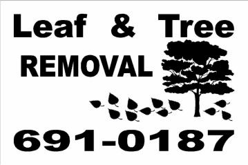
White is most common it tends to show the graphics better than the darker colors. It's also the cheapest to make and buy.
Ink Colors:
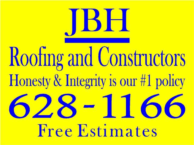
When purchasing the larger signs ink colors don't matter as much as when purchasing the smaller signs, the darker the ink the easier it will be to read it from a distance. The darker colors helps the eye distinguish the letters better.
Most color combinations work well, my best advice is to KEEP IT SIMPLE.
A yard sign is not meant to be out of this world fancy, lets save that kind of artwork for our custom printing department in creating your business cards, stationary, brochures, and such. Remember your potential clients have their cell phones and they use them, make it brief, and to the point so they have time to reach for the phone.
Sign Design
Sometimes the sign needs a lot of words, contact me and I will do my best to design your sign so that the main objective is visable to grab your potential clients attention.
DOES SIZE REALLY MATTER?
Of course it does. An 18 X 24 sign has 3 sq ft of surface while a 12 X 18 sign has 1.5 sq ft. It matters when a vehicle is 30 or 40 ft away as opposed to 20 ft. While the cars closer to the sign will be able to read it fine, the lettering will be smaller to the people further away.

*See Our Policies Page
*
Website Creation By Betty Hiland www.promotingtulsa.com